This article covers ggmap in R. I will show how you can create map-based scatter plots and density plots using ggmap in R. In other articles on this blog I have already provided examples on how to create heatmaps in R. For this I e.g. created density plots with deckgl and Leaflet.
As I frequently make use of gganimate for creating animations in R, and gganimate is compatible with ggmap, I also want to cover ggmap in R. That is what I do in this article.
Setting up data and packages for demonstrating ggmap in R
I first load the packages that I need for my analysis. You can see that in the lines of code below.
#devtools::install_github("dkahle/ggmap", ref = "tidyup") # since currently ggmap is not on CRAN
library(ggmap)
library(ggplot2)
library(dplyr)
library(gridExtra)
I will use a default dataset available in R for demonstration purposes in this coding example. The dataset that I will use is a dataset named “crime”. It contains spatial crime data. I provide a glimpse of the header of the dataset below.
head(crime)## time date hour premise offense beat
## 82729 2010-01-01 07:00:00 1/1/2010 0 18A murder 15E30
## 82730 2010-01-01 07:00:00 1/1/2010 0 13R robbery 13D10
## 82731 2010-01-01 07:00:00 1/1/2010 0 20R aggravated assault 16E20
## 82732 2010-01-01 07:00:00 1/1/2010 0 20R aggravated assault 2A30
## 82733 2010-01-01 07:00:00 1/1/2010 0 20A aggravated assault 14D20
## 82734 2010-01-01 07:00:00 1/1/2010 0 20R burglary 18F60
## block street type suffix number month day
## 82729 9600-9699 marlive ln - 1 january friday
## 82730 4700-4799 telephone rd - 1 january friday
## 82731 5000-5099 wickview ln - 1 january friday
## 82732 1000-1099 ashland st - 1 january friday
## 82733 8300-8399 canyon - 1 january friday
## 82734 9300-9399 rowan ln - 1 january friday
## location address lon lat
## 82729 apartment parking lot 9650 marlive ln -95.43739 29.67790
## 82730 road / street / sidewalk 4750 telephone rd -95.29888 29.69171
## 82731 residence / house 5050 wickview ln -95.45586 29.59922
## 82732 residence / house 1050 ashland st -95.40334 29.79024
## 82733 apartment 8350 canyon -95.37791 29.67063
## 82734 residence / house 9350 rowan ln -95.54830 29.70223You will notice: The dataset already contains longitude and latitude coordinates for all data entries. This is the spatial property of our dataset.
Accessing maps and visualizing them using ggmap in R
Next, I provide an example of how basemap tiles can be “pulled” from the ggmap package. In below code snipped I build up the basemap tiles for USA.
# plot a ggmap basemap
us <- c(left = -125, bottom = 25.75, right = -67, top = 49)
map <- get_stamenmap(us, zoom = 5, maptype = "toner-lite",legend="none")
plot(map)
Then “get_stamenmap” function is from the ggmap package.
Creating a first map-based scatterplot
We are now ready to create a first plot, based on the spatial properties of our dataset. Below I show the distribution of murder crime scenes, based on the coordinates provided the “crime” dataset. The “qmplot” function is from the ggmap package.
scatterplot_murder <- qmplot(x=lon,y=lat,data=filter(crime,offense=="murder"),legend="none",color=I("darkred"))
plot(scatterplot_murder)
I like scatterplots to show exact locations. Depending on the question or problem at hand this can be the right way to visualize spatial data. Sometimes, however, some kind of probability distribution along spatial dimensions is more helpful. For this I will now create a heatmap using ggmap in R.
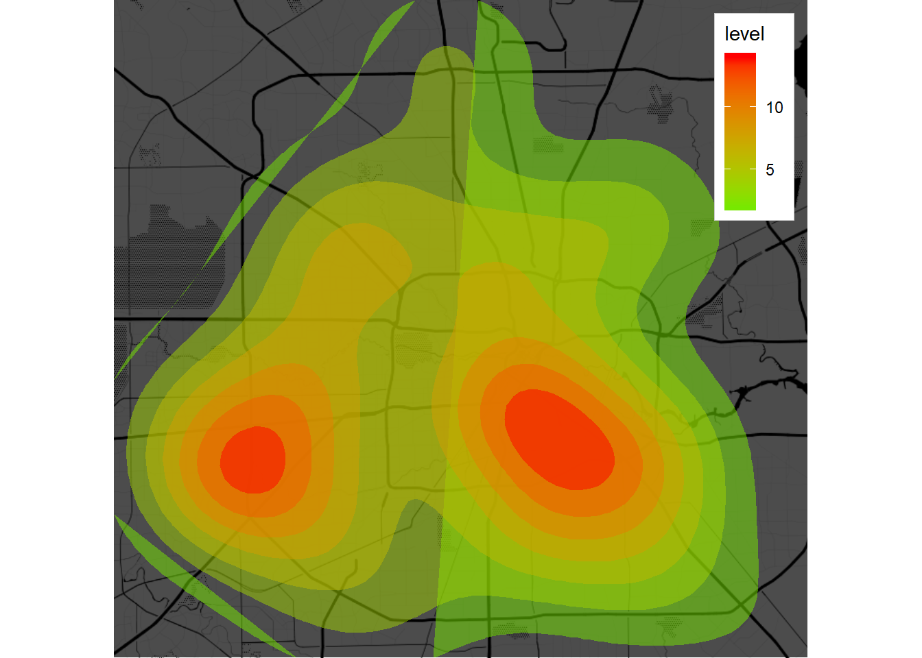
Drawing heatmaps to visualize spatial density
I will draw a heatmap (i.e. a density plot). For this I will need to specify the “geom”-parameter in the “qmplot” function to “polygon”. Also, I need to use the “stat_density_2d” and “scale_fill_gradient2” function. The density estimation is based on 2D kernel density estimation. It is calculated by the “stat_density_2d” function.
# create other types of plots with the ggmap package
densityplot_murder <- qmplot(x=lon, y=lat,
                             data = filter(crime,offense=="murder"),
                             geom = "blank",
                             maptype = "toner-background",
                             darken = .7,
                             legend = "topright") + stat_density_2d(aes(fill = ..level..),
                  geom = "polygon",
                  alpha = .5,
                  color = NA) + scale_fill_gradient2(low = "blue",
                       mid = "green",
                       high = "red")
plot(densityplot_murder)
In this example the visualisation is not perfect yet and could be improved further. Ways to do that would be e.g. by adjusting the density estimation calculation.
References to other content related spatial data visualization
I list some other relevant articles below. Some of them are published by on this blog, while others originate from external sources:
- Link: Monte-carlo simulation in r for warehouse location risk assessment
- Link: Pipelines for spatial data visualization in Python and R
- Link: Spatial data animation with ggmap and gganimate in R
- Link: Leaflet heatmaps in R
- Link: Coding a Leaflet Shiny app in R
- Link: Map and kernel density plots

Data scientist focusing on simulation, optimization and modeling in R, SQL, VBA and Python


Leave a Reply