Following a series of introductionary posts on spatial data visualization in R, covering packages such as ggmap, leaflet, tidygeocoder, geopy, deckgl and osmdata, I here present a framework utilizing some relevant packages. The framework was developed in R. It was implemented in a real-world project and was used to visualize the spread of defined groups. Members of these groups were registerered throughout the world over many years.
Below GIF displays an animation produced as part of the study. It visualizes how different specimen groups spread throughout Europe.

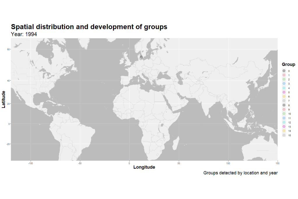
ggmap was used to access map tiles, allow one to specify bounding boxes. Below animation has a wider bounding box, animating worldwide detection spread.

Various R packages already introduced on this blog were used in this project. The figure below illustrated the packages used in this project. They comprise haven, dplyr, ggplot2, magrittr, transformr, gifksi, ggmap, and gganimate.

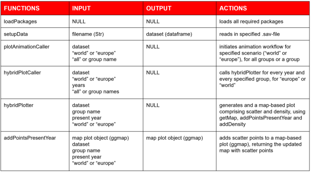
Using these packages, a wrapper-framework was developed. Two pipelines were implemented. Both piplines are initiated by the haven-package, used for reading .sav-files. The data is dataset is cleaned and prepared for visualization. At its code, ggmap map is used for accessing base maps and for visualizing data using ggplot2-syntax.
Using these packages, a wrapper-framework was developed. Two pipelines were implemented. Both piplines are initiated by the haven-package, used for reading .sav-files. The data is dataset is cleaned and prepared for visualization. At its code, ggmap map is used for accessing base maps and for visualizing data using ggplot2-syntax.
The first pipeline implements a workflow for creating hybrid plots such as the one displayed below. That is, a combination of a density plot, summarizing cumulative spatial spread throughout time, and a scatter plot, illustrating new detections in the current year.

For this first pipeline a caller function was implemented, calling a plotting function for every scenario (“europe” vs “world”) and for every year and group.

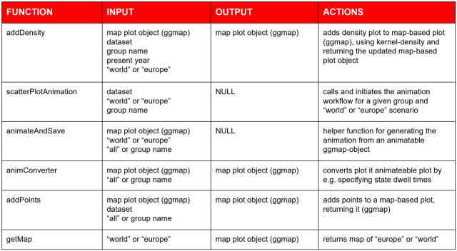
The second pipeline implements an animation workflow, producing animations such as the one displayed at the beginning of this post. Again, a top level caller function is implemented calling an animation function for a specified set of groups and “world-view” scenarios.

A more comprehensive description and documentation is provided in the figures below. You can find more documentation on spatial data analysis for SCM on this blog. For example, you can check out my documentation on spatial data visualization with deckgl in R.
Other documentation covering spatial data visualization in Python and R also available on this blog comprises e.g. tidygecoder and osmdata in R, as well as e.g. Geopy in Python and Leaflet in Python.

Data scientist focusing on simulation, optimization and modeling in R, SQL, VBA and Python


1 comment
Hi Linnart,
thank you for this great piece of work! It will be very useful for my own work.
Warmest regards,
Hans