I have already demonstrated how you can retrieve e.g. GDP data from FRED using pandas_datareader in Python. I have also analyzed stock prices for Procter & Gamble using Yahoo Finance as a source and pulling the data via pandas_datareader.
In this post I want to analyze daily stock returns, for UPS and FedEx. I will pull the data using pandas_datareader. I will the conduct further analysis on the data and visualize the results using matplotlib.pyplot.
As always, first step is to import relevant modules:
# import relevant modules
import pandas as pd
import pandas_datareader.data as web
import datetime
import matplotlib.pyplot as plt
Next step is to pull the stock price data from Yahoo Finance via pandas_datareader:
# define datetimes for start and end dates
start_date = datetime.datetime(2000, 1, 1)
end_date = datetime.datetime(2020, 9, 30)
# import stock data for given period between start and end date form yahoo finance
ups = web.DataReader("UPS", "yahoo", start_date, end_date)
fedex = web.DataReader("FDX", "yahoo", start_date, end_date)
We will need some helper functions in this post. I first define a daily stock return plotting function:
def plottingReturns(title,xtitle,ytitle,df1,df2,color1,color2,returns1,returns2,alpha1,alpha2):
    # create figure
    plt.figure(figsize=(17.5,10))
    # create line plots for daily returns
    plt.plot(df1.index,returns1,color=color1,alpha=alpha1)
    plt.plot(df1.index,returns2,color=color2,alpha=alpha2) # df1.index placed here on purpose
    # add title to plot
    plt.title(title, size=22)
    # add x-axis label
    plt.xlabel(xtitle, size=16)
    # add y-axis label
    plt.ylabel(ytitle, size=16)
I also define a histogram plotting function for plotting the distribution in daily stock returns:
def histogramReturns(title,xtitle,ytitle,color1,color2,returns1,returns2,alpha1,alpha2,name1,name2):
    # create figure
    plt.figure(figsize=(17.5,10))
    # create line plots for daily returns
    plt.hist(returns1,histtype="bar",color=color1,alpha=alpha1,label=name1,bins=100)
    plt.hist(returns2,histtype="bar",color=color2,alpha=alpha2,label=name2,bins=100) # df1.index placed here on purpose
    # add title to plot
    plt.title(title, size=22)
    # add x-axis label
    plt.xlabel(xtitle, size=16)
    # add y-axis label
    plt.ylabel(ytitle, size=16)
In addition, I define a stock price time series plotting function:
def plottingPrices(title,xtitle,ytitle,df1,df2,color1,color2):
    # create figure
    plt.figure(figsize=(17.5,10))
    # create line plots for daily closing prices
    plt.plot(df1.index,df1["Close"],color=color1,alpha=0.5)
    plt.plot(df1.index,df2["Close"],color=color2,alpha=0.5) # df1.index placed here on purpose
    # add title to plot
    plt.title(title, size=22)
    # add x-axis label
    plt.xlabel(xtitle, size=16)
    # add y-axis label
    plt.ylabel(ytitle, size=16)
Finally, I define a daily stock return calculating function:
def returns(df):
    prices = df["Close"]
    returns = [0 if i == 0 else 100*(prices[i]-prices[i-1])/(prices[i-1]) for i in range(0,len(prices))]
    return(returns)
Now I use above daily stock return calculating function to calculate UPS and FedEx daily stock returns since 2020, based on daily stock closing prices:
return_ups = returns(ups)
return_fedex = returns(fedex)
I proceed with print the length of both return lists, thereby making sure that the data is consistent:
print(len(return_ups))
5220
print(len(return_fedex))
5220
I also test that the length of the ups and fedex data frame date list is the same as the length of the daily stock returns list:
print(len(ups.index))
5220
print(len(fedex.index))
5220
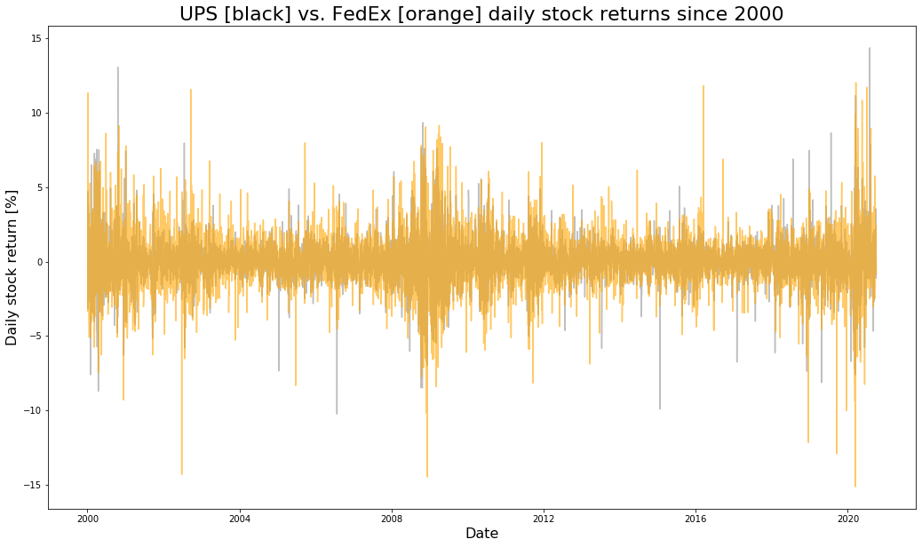
The test is successful. The data seems to be consistent. Now I use the plotting function already defined to visualize daily stock returns for UPS and FedEx since 2000:
plottingReturns("UPS [black] vs. FedEx [orange] daily stock returns since 2000","Date","Daily stock return [%]",ups,fedex,"black","orange",return_ups,return_fedex,0.25,0.60)

Lets look at the distribution of daily stock returns for UPS and FedEx, using the histogram plotting function from above:
histogramReturns("Histogram of daily stock returns for UPS [black] and FedEx [orange]","Daily return [%]","Absolute frequency [-]","black","orange",return_ups,return_fedex,0.25,0.60,"UPS","FedEx")

Finally, to complete this analysis, let us plot stock closing price development throughout time since 2000. For this I use the price plotting function defined in the top of the post at hand:
plottingPrices("Daily stock price development for UPS [black] and FedEx [orange]","Date","Daily stock closing price [USD]",ups,fedex,"black","orange")

FedEx has been a more profitable investment on average, but it has also been more risky.

Data scientist focusing on simulation, optimization and modeling in R, SQL, VBA and Python


Leave a Reply