In other posts I have demonstrated how one can use quandl in Python to query time series data on e.g. equity prices. In this post I demonstrate how one can query stock price data from e.g. Yahoo finance, using the pandas_datareader module in Python.
In the example below I import pandas_datareader and query Procter & Gamble stock price data between 2020-01-01 and 2020-09-29:
# import relevant modules
import pandas_datareader.data as web
import datetime
# define datetimes for start and end dates
start_date = datetime.datetime(2020, 1, 1)
end_date = datetime.datetime(2020, 9, 29)
# import stock data for given period between start and end date form yahoo finance
df = web.DataReader("PG", "yahoo",start_date, end_date)
# display returned dataframe header
df.head()
| High | Low | Open | Close | Volume | Adj Close | |
|---|---|---|---|---|---|---|
| Date | ||||||
| 2020-01-02 | 124.730003 | 122.940002 | 124.500000 | 123.410004 | 8130800.0 | 121.104179 |
| 2020-01-03 | 123.529999 | 121.860001 | 122.160004 | 122.580002 | 7970500.0 | 120.289688 |
| 2020-01-06 | 123.190002 | 122.379997 | 122.570000 | 122.750000 | 6674400.0 | 120.456505 |
| 2020-01-07 | 123.209999 | 121.870003 | 122.879997 | 121.989998 | 7583400.0 | 119.710701 |
| 2020-01-08 | 123.430000 | 122.000000 | 122.190002 | 122.510002 | 5385100.0 | 120.220985 |
Using matplotlib.pyplot I can visualize the data by e.g. plotting daily closing prices. This is what I do in the following lines of code:
# import matplotlib.pyplot
import matplotlib.pyplot as plt
# create figure
plt.figure(figsize=(17.5,10))
# create line plot for closing prices
plt.plot(df.index,df["Close"],color="red")
# add title to plot
plt.title("Procter & Gamble daily stock closing prices (src: Yahoo)",size=22)
# add x-axis label
plt.xlabel("Date",size=16)
# add y-axis label
plt.ylabel("Closing price [USD]",size=16)
Text(0, 0.5, 'Closing price [USD]')

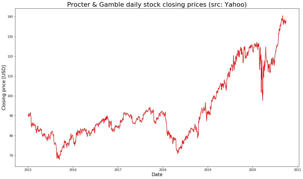
Below I another example, retrieving and visualizing stock price data going all the way back to 2015:
# query data again
df = web.DataReader("PG", "yahoo",datetime.datetime(2015,1,1), datetime.datetime(2020,9,29))
# create figure
plt.figure(figsize=(17.5,10))
# create line plot for closing prices
plt.plot(df.index,df["Close"],color="red")
# add title to plot
plt.title("Procter & Gamble daily stock closing prices (src: Yahoo)",size=22)
# add x-axis label
plt.xlabel("Date",size=16)
# add y-axis label
plt.ylabel("Closing price [USD]",size=16)
Text(0, 0.5, 'Closing price [USD]')

And finally another example going back all the way to year 2000:
# query data again
df = web.DataReader("PG", "yahoo",datetime.datetime(2000,1,1), datetime.datetime(2020,9,29))
# create figure
plt.figure(figsize=(17.5,10))
# create line plot for closing prices
plt.plot(df.index,df["Close"],color="red")
# add title to plot
plt.title("Procter & Gamble daily stock closing prices (src: Yahoo)",size=22)
# add x-axis label
plt.xlabel("Date",size=16)
# add y-axis label
plt.ylabel("Closing price [USD]",size=16)
Text(0, 0.5, 'Closing price [USD]')


Data scientist focusing on simulation, optimization and modeling in R, SQL, VBA and Python


Leave a Reply